First Knock Moving
First Knock Moving is a Toronto and GTA moving company serving homeowners, offices and real-estate clients since 2015. Their old website no longer matched the quality of the service, and an invitation to present to a room of high-end real-estate agents made the timing clear: they needed a site they could send people to with confidence, and a way to make a strong first impression in person.
I designed and built the complete website from scratch, then created a private referral page and a limited run of numbered business cards for the event, all delivered against a fixed deadline.
View Live Site →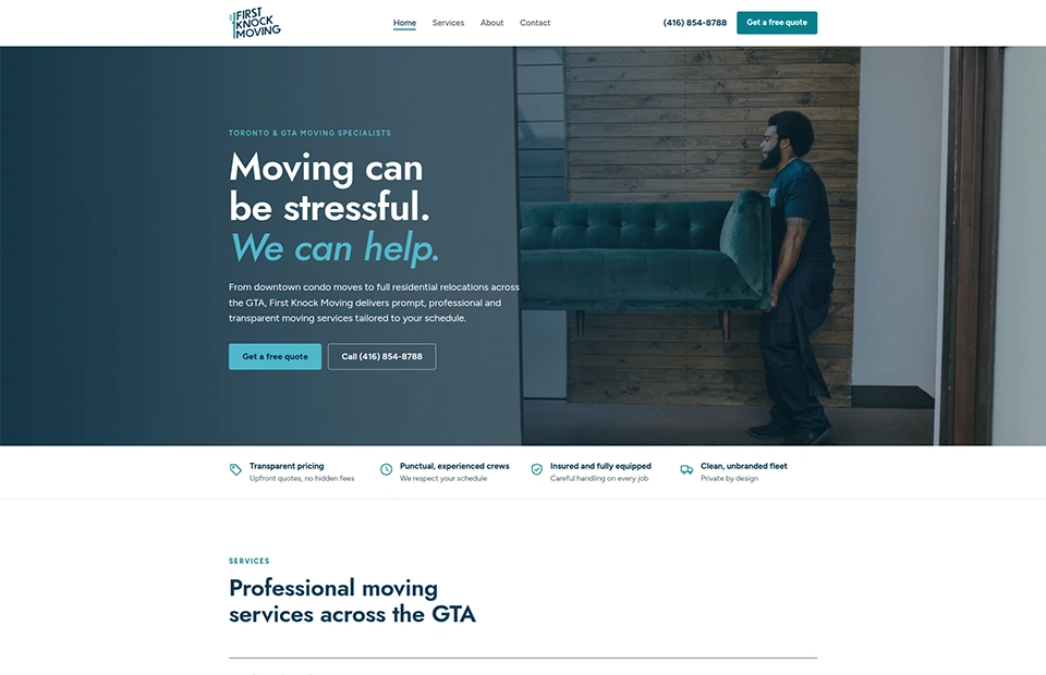 firstknockmoving.ca
What the client needed
Premium, but approachable
A site polished enough to earn trust with high-end Toronto real-estate agents, while staying warm, honest and easy for everyday homeowners — never a stuffy luxury brand.
Built for phones first
Many visitors would arrive by scanning a card and opening the site on their phone, so mobile had to be the priority rather than an afterthought.
Quotes in a tap
A quote request reachable from anywhere on the site, keeping the fields customers already knew without a large form dominating the page.
Clear services
Residential and office moves, storage, and furniture transport for real-estate agents, each explained simply and with confidence.
Honest social proof
Real client reviews, restyled to feel premium — no invented testimonials and no inflated claims.
A page just for agents
A private page, reachable only by QR code, built to answer one question: can I trust this company with my clients?
A card worth keeping
Business cards that feel like a collectible — numbered, premium, tied to the event — and lead straight to the private page.
A fixed deadline
Everything live and tested before the event, with the existing domain and business email left completely undisturbed.
What I delivered
Website
Custom-coded & live
- Responsive Home, Services, About and Contact pages
- Mobile-first layout with a floating quote button and an expanding quote form
- Service descriptions, FAQs and restyled real reviews
- Hosting and domain moved to fast, secure infrastructure, with the existing business email kept fully intact
- Quote form routed to the right inbox, with spam filtering and tested delivery
Private agent page
QR-only & hidden from search
- A single-page experience designed around trust, with a refined black-and-white look
- A fade-in welcome and a clear story of the company’s experience with high-end clients
- A client referral form and a call-back request, both tested end to end
- A direct line to the owners, so every agent knows who they are referring to
Event business cards
30 numbered, collectible cards
- A black-and-gold collector’s design, numbered 01/30 through 30/30
- A working QR code on every card, leading to the private page
- Print-ready files prepared to the printer’s CMYK, bleed and safe-area specifications
- Presentation mockups for the final set
A numbered edition of 30
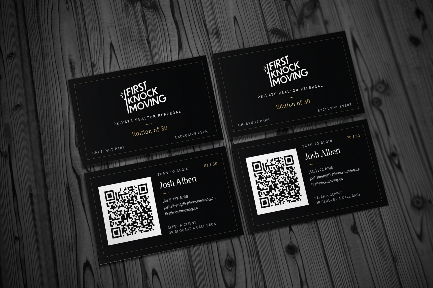
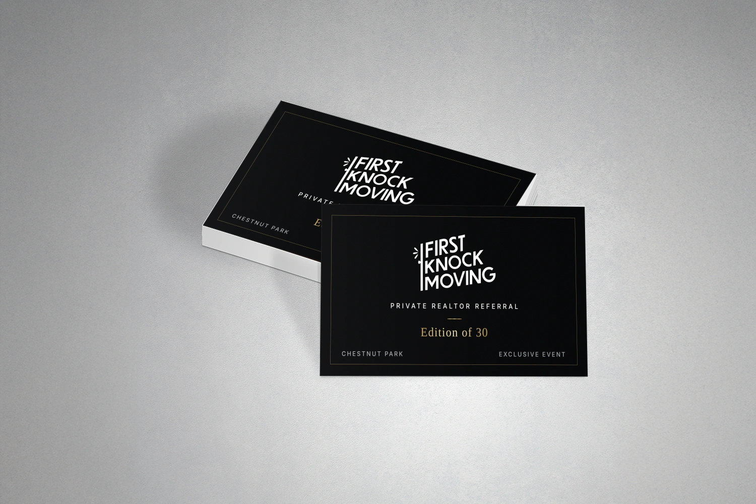
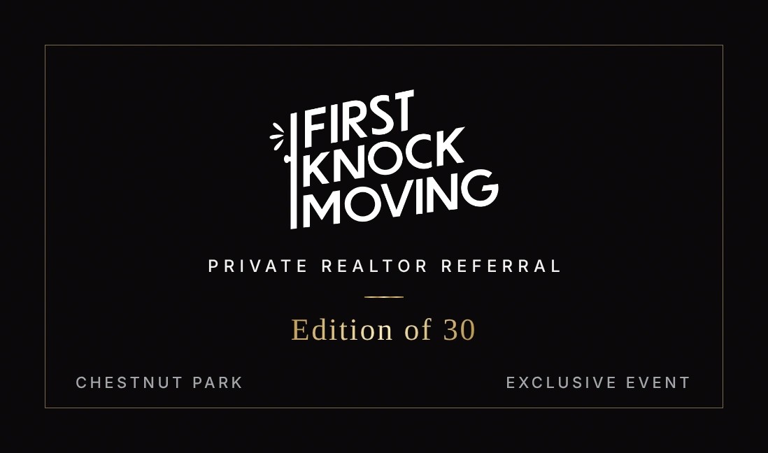
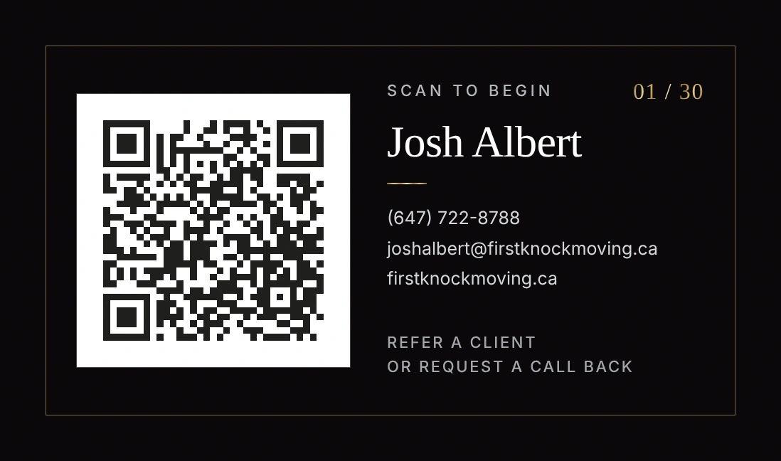
Every card in the edition shares one front. Each back carries its own serial number, from 01/30 to 30/30.
Ana Genesis
Ana Genesis is a Memphis-based organization. Working remotely, I took on two parts of their visual presence: a new identity, and the website that carries it.
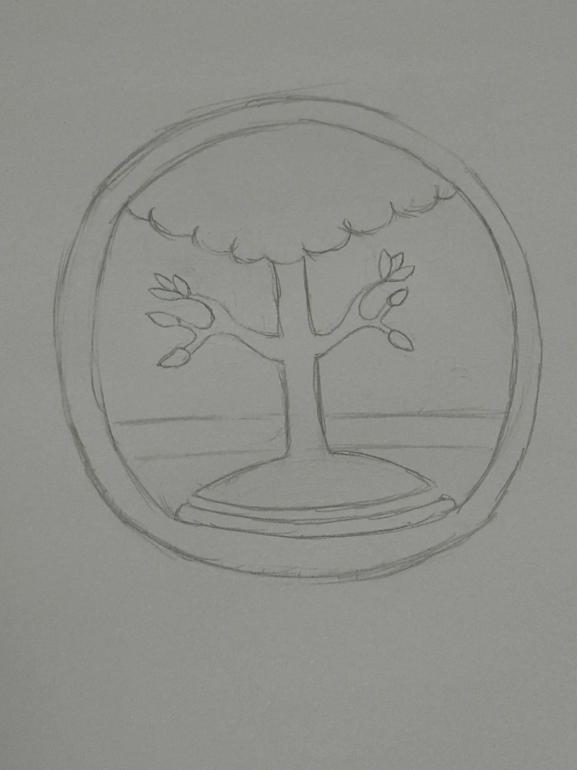
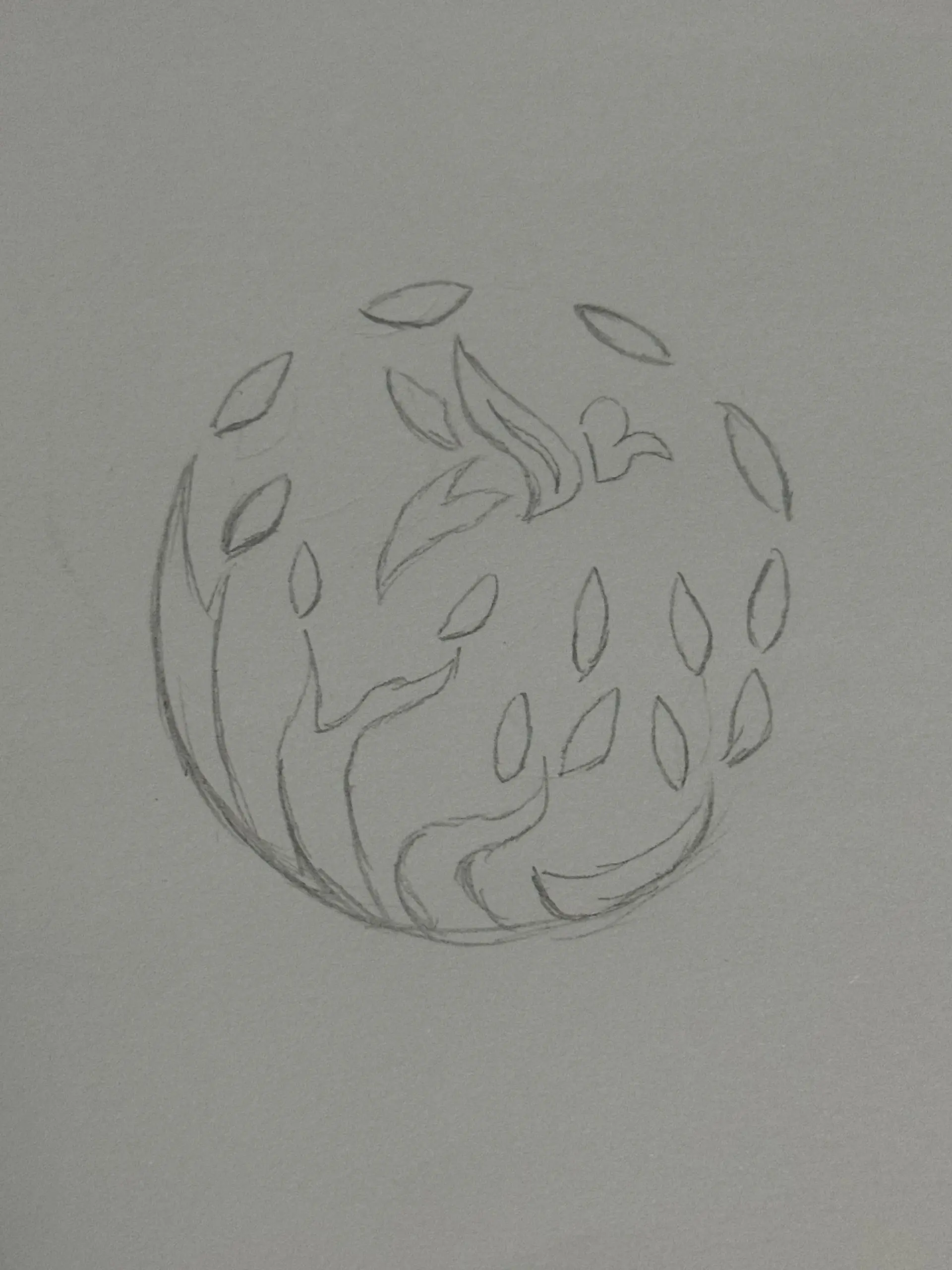
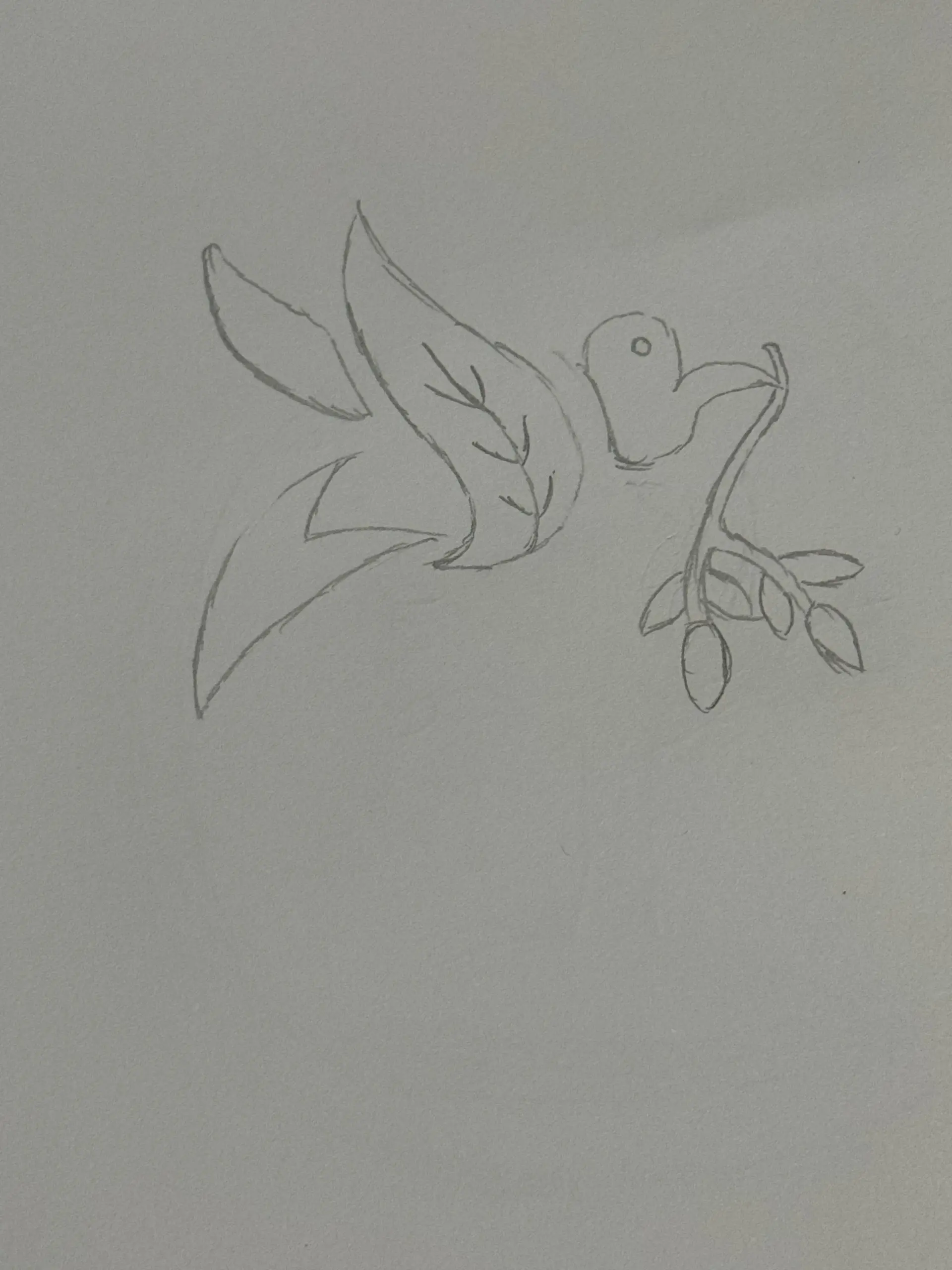
I began with rough concept sketches and developed the idea into a finished wordmark and logo. From there I turned to the website, preparing its photography, implementing SEO strategies, and reformatting the pages for mobile devices.

What I delivered
Identity
Wordmark & logo
- A wordmark and logo for the organization
- Developed from initial concept sketches through to a finished mark
Website
Photos, SEO & mobile
- Photography edited and optimized for the site
- Search engine optimization strategies implemented
- The website adapted and formatted for mobile devices
From rough sketches to a finished mark
Designer Sewing Center
Designer Sewing Center is a sewing store in Zionsville, Indiana. Over three years I worked directly with the owner on how the store presented itself: in the shop, on social media, and online.
That meant designing the store’s logo, creating ongoing in-store promotional materials, producing Facebook and Instagram advertising content, and photographing products for its e-commerce listings.
What I delivered
In the store
Identity & promotion
- A logo for the store
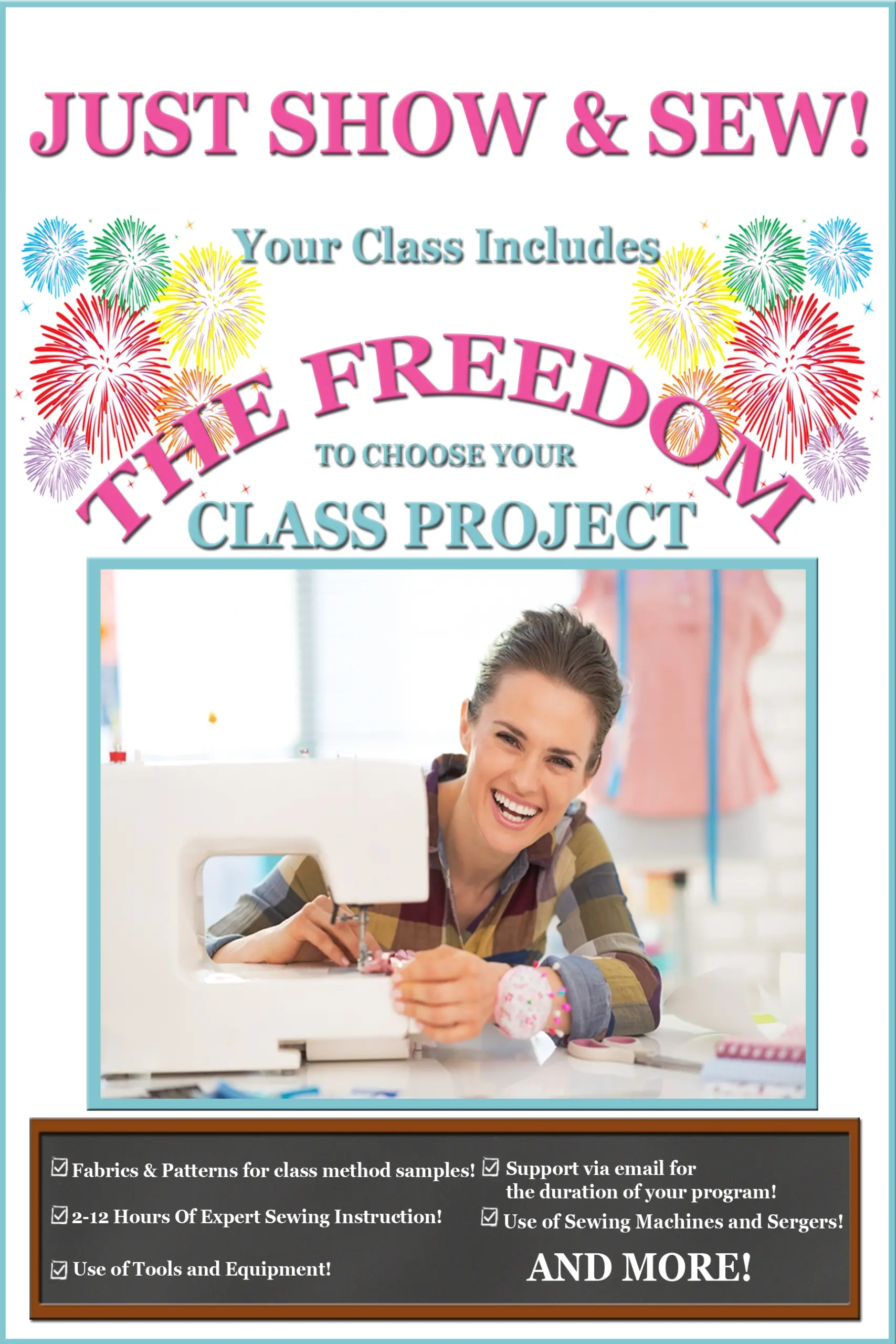
- Ongoing in-store promotional materials, including posters
Online
Social media & e-commerce
- Facebook and Instagram advertising content, created in collaboration with the owner
- Product photography captured and edited for e-commerce listings, to help support online sales
Albert Foods & My Beautiful Dog
Two brands, each needing a mark of its own. For both, I developed the logo from first concept through to final files.
Albert Foods
A bold, colourful mark for a food brand, delivered as final files ready for use.
My Beautiful Dog
A friendly, playful mark for a dog-focused brand, developed from concept through to final files.